Make an SEO impact this 2024 with our mobile-first indexing strategy, packed with real-life cases, tool recommendations, and a six-week optimization roadmap for businesses.
Mobile-first indexing is a Google initiative that looks at the mobile version of websites first to decide how they should appear in search results. Why? These days, most of us are pulling out our phones to find answers on the go. So, Google wants to make sure that when you search for something, the websites that show up are ready to give you a great experience on your smartphone.
But why did Google move to mobile-first indexing, and why is it important for SEO?
Well, previously, Google’s algorithms would scrutinize a website’s desktop version to determine its relevance to a query. However, the surge in mobile usage introduced a significant challenge: if a site’s mobile version contained less content than its desktop counterpart, this discrepancy could potentially distort search results and degrade the user experience.
This shift was starkly evident as early as the first quarter of 2015, when mobile devices accounted for 31.16% of website traffic worldwide. Responding to this trend, Google introduced their mobile-friendly update in the same year to boost the ranking of mobile-friendly pages on mobile search results.
By 2016, Google had initiated mobile-first crawling and indexing. As mentioned, this meant that Google would primarily use a site’s mobile version for indexing and ranking.

Source for YoY the percentage of Mobile searches since 2015: https://www.statista.com/statistics/277125/share-of-website-traffic-coming-from-mobile-devices/
If you look at the graph, there was a continuous uptick in mobile searchers, which reached 53.42% in the last quarter of 2023. It was also this time, October 2023, when Google completed their rollout for mobile-first indexing.
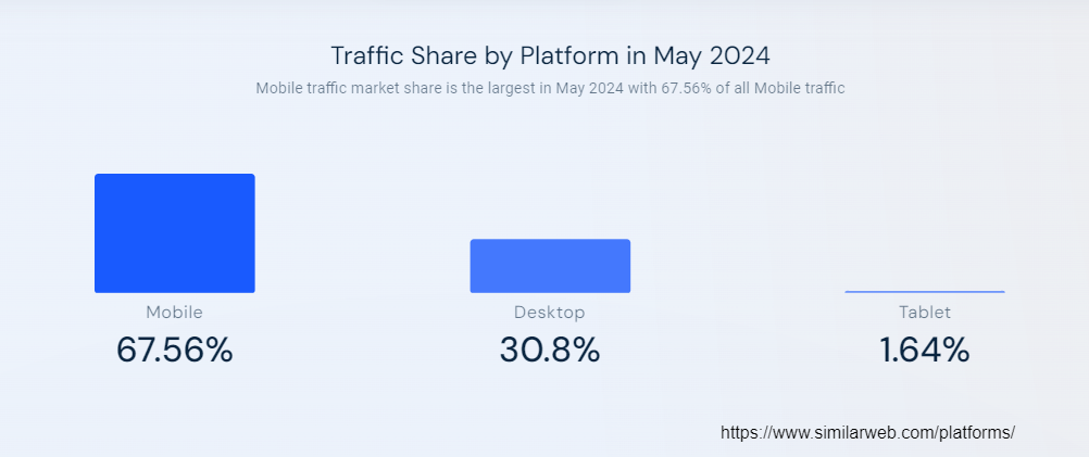
And in February 2024, mobile searches constituted 65.89% of global organic searches, further cementing the dominance of mobile browsing and the ongoing relevance of mobile-first indexing.
Source: https://www.similarweb.com/platforms/
As per Google, having a mobile version of your pages isn’t mandatory for your content to be included in their search results.
Well, if that’s the case, why do I have to care about mobile-first indexing?
Because simply appearing in search results doesn’t guarantee your spot at the top of the page. If you don’t want to be left out on this shift, keep scrolling down.
The shift to mobile-first indexing is a clear signal that the mobile version of your website is now the front-runner in the SEO race. Simply put, websites not optimized for mobile devices might see a decline in their search rankings, potentially leading to diminished visibility and a loss in organic traffic.
This also becomes a wake-up call for website owners to prioritize the mobile user experience, which includes factors like page speed and responsiveness.
A website optimized for mobile offers seamless navigation and quick access to information, fostering higher engagement levels and encouraging visitors to spend more time exploring your site. This not only elevates user satisfaction but also signals to Google the relevance and value of your site, potentially boosting your search engine rankings.
And, in fact, Google strongly advises webmasters and SEO professionals to calibrate their sites for mobile-first indexing. This entails double-checking that the website is mobile-friendly and that content continuity is maintained across desktop and mobile platforms.
A comprehensive list of best practices for mobile-first indexing has been provided by Google. These include directives such as making sure Googlebot has access to render content, confirming that content is mirrored on both desktop and mobile and cross-checking structured data.
Consider the case of one of our clients, a global travel agency based in the United Kingdom.
A few months before Google finished their mobile-first indexing rollout in 2023, this client had a considerable web presence, attracting roughly two million global customers monthly.
But after October 2023, there were several problems on their site.
Among these issues were also smaller ones such as inaccessible navigation and unresponsive design that exacerbated the core problem, leading to a drop in engagement from users and eventually a SERP ranking drop of almost 65.3%.
The loss of organic traffic would directly impact sales, as fewer potential customers would visit their website.
Let’s quantify the cost then.
The monthly revenue loss due to the drop in traffic would be: $133,200.
We’re not even finished yet. To compensate for the drop in organic traffic, this agency had to invest more in paid media management to drive traffic to their website, resulting in higher marketing expenses.
We’re talking about an additional $25,000 per month in marketing to compensate for the loss in organic traffic. The total monthly financial loss is:
$133, 200 + $25,000 = $158,200
Let’s read that again: $158,200 per month due to the issues caused by ignoring mobile-first indexing.
See how drastic that was for such a seemingly small-scale problem?
Now, we need to know how to stop it from happening to your business.
At its core, Google’s ranking algorithm prioritizes relevance, quality, and usability across both mobile and desktop searches. But whenever someone uses a smartphone or tablet, they also rank results based on mobile-friendliness.
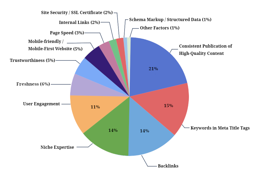
Source: https://firstpagesage.com/seo-blog/the-google-algorithm-ranking-factors/
Based on the chart above, here are the top five factors you should allocate most of your efforts to:
While not dominating the charts, it’s notable that mobile-friendliness, freshness, and trustworthiness are climbing up their ranks, and it’s only safe to assume they’ll continue to do so.
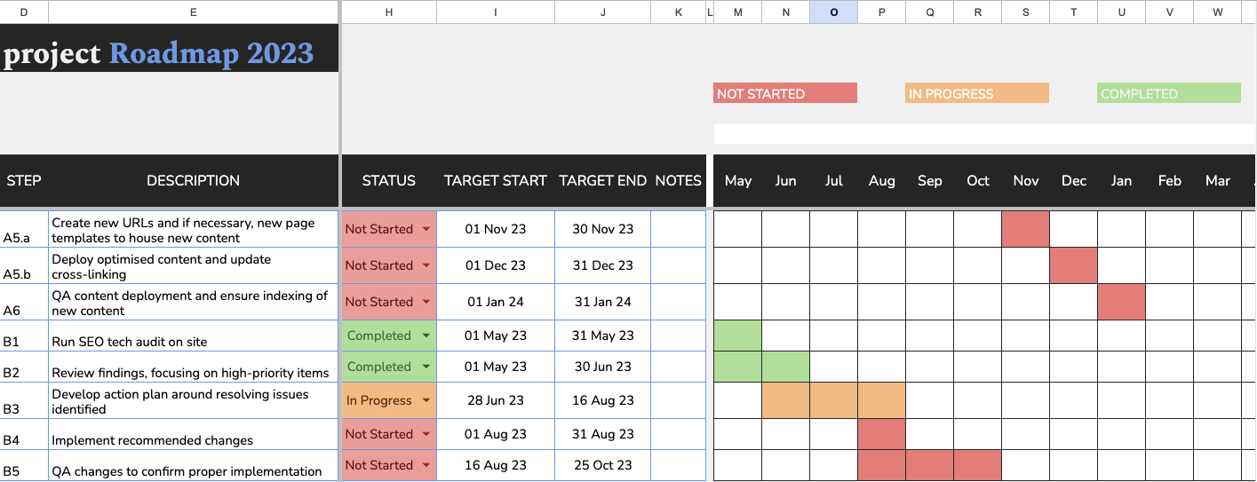
Optimizing your website for mobile-first indexing is essential for SEO success. Here’s your road map outlined in weeks.
Goal: Conduct a thorough audit of the current mobile website to identify all existing issues and set a clear, actionable roadmap for the optimization process.
Milestone: Complete the audit and documentation of key issues with prioritized action items and set SMART goals for the mobile optimization project by the end of Week 1.
Create a Detailed Audit Report using Google Sheets
Develop a structured, itemised audit report that meticulously details every issue affecting mobile-first indexing. You can use Google Sheets or any platform that’s easy to disseminate these insights for your team.
For each identified problem, include:
#1: Findings
Clearly articulate what the issue is, providing examples or screenshots where applicable to illustrate how it impacts the mobile user experience.
Use Google’s Mobile-Friendly Test to evaluate mobile usability.
Run Google PageSpeed Insights to analyze loading times and performance bottlenecks.
Let’s say we want to check out Semrush.
Enter the URL and make sure to select the mobile option.

Once you run diagnostics, document these initial findings, including issues related to loading speeds, responsiveness, navigation, text and button sizes, and image optimization.

#2: Impact in SEO
Assess and document how the issue affects site functionality and user interaction on mobile devices. Consider how these problems might hinder crawlability or indexability from a mobile-first perspective.
After cataloging each issue, apply a systematic approach to prioritization:
#3: Recommendations
Offer initial thoughts on potential fixes. Where relevant, suggest tools or plugins that could assist in addressing the issue, or reference industry best practices for resolving similar challenges.
#4: Priority Ranking
Assign a severity level to each issue—high, medium, or low—based on its impact on SEO performance. Use specific criteria for each level to ensure consistency. For example, “high” severity could be issues that completely prevent a page from being mobile-friendly, such as non-responsive design or inaccessible content.
To give you a better picture, here’s an example of an audit checklist.
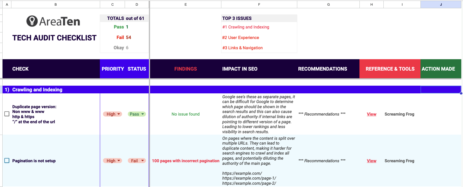
Action Timeline: Suggest an estimated timeline for addressing each issue based on its priority, with urgent fixes tackled immediately.
Tip: Set SMART Goals
Define specific, measurable, achievable, relevant, and time-bound (SMART) goals based on the audit findings.
Instead of general goals like “improve load times,” specify targets such as “reduce mobile page loading time by 30% within six weeks.” Ensure these targets are realistic by considering the benchmark data and the resources available.
Outline a strategic plan to reach these targets. Include specific actions, responsible parties, and milestones. For example, if the goal is to improve mobile usability scores, one action might be to redesign key elements of the interface for better touch-screen responsiveness.
Plan for Week 2
Based on the audit findings and established goals, outline the tasks and objectives for Week 2, focusing on addressing the highest priority issues first.
Schedule meetings or sessions to discuss and delegate tasks for the design and user experience enhancements in Week 2.
In Week 2, your focus is on enhancing the design and user experience (UX) for mobile users.
Goal: Enhance the design and user experience (UX) on mobile devices to ensure the website is fully responsive and optimized for user engagement.
Milestone: By the end of Week 2, achieve a user-tested, responsive design that adheres to best practices in mobile UX.
Step #1: Simplify Navigation
Step #2: Fluidity and Flexibility
Mobile screens come in various sizes, and your site needs to be beautiful on each one.
Don’t forget to test across devices: Test how these changes look on various devices to confirm that your adjustments provide a consistently stellar visual experience.
Step #3: Media Queries—The Magic Behind Responsive Design
Media queries make responsive design possible.
Step #4: Optimize for Mobile Viewing with the Viewport Meta Tag
The viewport meta tag is the unsung hero of mobile optimization. It controls how your page is scaled and displayed on different devices, which is crucial for maintaining usability.
Proper Implementation
Ensure this tag is correctly placed in the HTML of every page to control layout on mobile browsers effectively.
Step #5: Consistency Across Devices
Ensure your mobile and desktop sites offer the same content. Users and search engines alike value consistency. Content discrepancies between the mobile and desktop versions of your site can mislead Google’s algorithms about the relevance and comprehensiveness of your site’s content.
Review and Adjust
Check both versions of your site. If the mobile version trims down features or content, you might want to rethink that. What’s available on desktop should be accessible on mobile.
Be Careful with Click to Expand
Also, it’s wise to be careful with things like “click to expand” buttons. While they’re great for interactive engagement, remember that Googlebot might not always click around to reveal hidden content. This means some of your valuable information could get missed during indexing.
This also includes being careful when using those special HTML tags—like the ones for headings and links—correctly so Google can easily figure out what’s important on your page.
Don’t forget alt text
And don’t forget about your images and videos.
Making sure your pictures have helpful descriptions (those alt attributes) helps search engines and folks who use screen readers understand what’s on your site. As for videos, where you place them matters a lot. You want them front and center so people can find them without having to scroll for days.
Engaging Users in the Process
What better way to know if you’re on the right track than by asking the users themselves? Use tools like UserTesting and TryMyUI to get real-time feedback on your UX enhancements.
Gather insights directly from your target audience. As you complete your checklist for each week, you’ll be able to incrementally iterate on the design based on user feedback to refine the user experience.
For a prime example, let’s look at our “About Us” section. On your desktop, try opening Chrome DevTools.
This is what you’ll see.


Clicking it will show you how different devices adapt to the website. For the image below, notice how the dimensions are sized according to the iPhone 14 Pro Max.
Despite the limitation of a smaller screen, the images are sized to enhance the text rather than overwhelm it.
Pay attention to the tactile aspects of the page—each button and link is tailored for easy interaction, ensuring that all navigation feels intuitive and effortless. Even the content’s layout is designed for optimal readability on mobile devices. The text is clear, legible, and well-spaced, making it easy to digest the information without zooming in or straining your eyes.
You can choose other devices to ensure all the elements adapt as you’d expect.

Make this your mantra: speed can always be improved. Our goal this week is to squeeze out every last millisecond of load time.
Milestone: Achieve a minimum of 20% improvement in website speed metrics as assessed by Google PageSpeed Insights by the end of the week.
Step #1: Measure, Measure, Measure
Start your week with a cup of coffee and a fresh performance assessment. Refer to the insights you’ve found from speed optimization tools like Google PageSpeed insights.
Action Tip: Run these tools early Monday morning or whenever you start the week. Compare the new data with your benchmarks from Week 1. Look for any downward trends or areas that haven’t improved as expected.
Step #2: Image Optimization—A Picture’s Worth a Thousand Pixels
Did you know that bulky images are one of the top culprits in slowing down your site? Let’s trim the fat without losing quality.
TinyPNG, CompressJPEG, or ImageOptim are tools that can compress your images into smaller files that load faster without making them look pixelated.
Implement Lazy Loading
This ensures images and videos load only when they’re actually in view on the user’s screen, thereby helping you save valuable data and speed up the initial page load.
Real-World Application
Imagine a user browsing your site on a slow mobile connection. Lazy loading means they can start interacting with the content that’s visible without waiting for offscreen images to load.
Step #3: Browser Caching—Make Their Second Visit A Breeze
When you store elements of your site locally in the user’s browser, you cut down on load times significantly during their next visit.
Tools to Use
If you’re using WordPress, plugins like W3 Total Cache or WP Super Cache can be set up in minutes and will handle the heavy lifting for you.
Insider tip: Configure your caching tools to focus on large files such as images, CSS, and JavaScript. This is where you’ll get the most bang for your buck.
Step #4: Set up a CDN
A Content Delivery Network (CDN) is like having multiple delivery trucks for your content all over the globe, which helps ensure it gets to your users as quickly as possible.
Pro Tip: Test different CDN providers with a small segment of your traffic to see which offers the best performance improvements.
Step #5: Tune-Up Your Backend with Server-Side Optimizations
Step #6: Rigorous Documentation
End your week by documenting everything. Which changes did you make? What was the impact?
Keep detailed records to help guide your future optimizations. What worked? What didn’t? This is valuable data that can drive your strategy moving forward.
After addressing the core user experience and speed issues, we need to deal with the structure of URLs and how content is indexed by search engines.
Goal: Implement and optimize canonical and alternate link elements to ensure proper indexing and avoid duplicate content issues across different versions of the website.
Milestone: By the end of Week 4, all key webpages should have correct canonical tags and appropriate alternate links established, with verification through Google Search Console to confirm accurate indexing.
What’s the big deal? Think of it like giving Google clear directions to your content’s best versions. This helps avoid the confusion of duplicate content across device-specific versions of your site and ensuring Google understands your preferred URL for each page.
Step #1: Audit Your Current Links
First things first, you need to review your site to identify potential content duplication across different URLs.
Action Tip: Use Screaming Frog to crawl your site. Look for pages with similar content and check if they have canonical tags pointing to the preferred URL. No tags? Time to add some.
Step #2: Get Your Canonical Tags Right
Once you’ve identified duplicates, it’s time to direct Google to your preferred pages using rel=”canonical” tags. Apply the rel=”canonical” tag to specify the preferred version of each page. Use absolute URLs to avoid confusion for search engines.
Real-World Example: Imagine you’ve got two versions of a product page. One’s optimized for mobile, and one’s not. By setting the mobile-optimized page as the canonical version, you’re telling Google, “This is the best version for indexing.”
Step #3: Implement Alternate Tags
Now, for websites with content in multiple languages or formats (like mobile vs. desktop), rel=”alternate” tags help Google serve the right content to the right users, which enhances the user experience and SEO.
Action Tip: Check your pages with different language versions or mobile-specific URLs. Set up rel=”alternate” tags using the hreflang for language and “media” for device-specific versions. This helps ensure that a user on a smartphone in Spain gets the Spanish mobile version of your site.
Step #4: Document, document, document
None of this matters if you and your team aren’t on the same page. Document every change and decision in an accessible format. Hold a training session to explain why these tags are crucial and how to update them as your site evolves.
Why It’s Crucial: Your content team throws up a new blog post from a coffee shop in Berlin. They know to tag it with an hreflang attribute for German readers. You’ve just avoided diluting your SEO efforts and improved targeting.
After canonical and alternate link adjustments, we need to ensure that the right pages are being indexed correctly after structural changes. Getting in deeper with the backend means ensuring that every tweak, every tag and every line of code we’ve adjusted for the past few weeks is optimized for mobile indexing.
Milestone: By the end of Week 5, confirm that all critical content is accessible to Googlebot, particularly the mobile Googlebot, and that the Google Search Console reflects accurate and optimized site information without any crawl errors.
A primary obstacle encountered in mobile-first indexing is the potential discrepancy in how servers respond to the mobile Googlebot compared to traditional desktop crawlers.
When some servers or site configurations apply different rules based on the perceived user agent, it can prevent the mobile Googlebot from accessing the full content of the site. This discrepancy can result in incomplete or inaccurate indexing of your mobile site content, which can ultimately affect your rankings.
To counteract this, it’s important that you configure servers and site settings to treat all user agents, including mobile Googlebot, uniformly. You want to meticulously review and adjust your robots.txt files and metadata tags to ensure they do not inadvertently block or restrict access to mobile versions of the site.
Ensuring that your hosting solution has the bandwidth to accommodate an increase in mobile crawl requests is also crucial for maintaining site performance and indexation.
Step #1: Robots.txt Audit
The robots.txt file may be small, but it wields huge power over how search engines interact with your site.
Step #2: Optimizing Google Search Console Settings
Google Search Console is your mission control for understanding how Google views your site. It’s time to ensure everything is dialed in perfectly.
Step #3: Mobile Sitemap Submission and Verification
Your sitemap helps Googlebot find its way through your site. With a focus on mobile, this step becomes even more crucial.
Step #4: Resolve Any Crawl Errors
Even the best websites can encounter roadblocks—like 404 errors or misconfigured servers—that prevent Googlebot from accessing content.
Step #5: Perfecting URL Inspection Outcomes
Now, let’s make sure Googlebot not only accesses but also correctly renders and indexes your pages.
Ensure that everyone from developers to content creators is up to speed on any changes in Google’s indexing practices that might affect your site. Keep a close eye on how changes affect your site’s performance in the Google Search Console. Set up alerts to notify you of issues as they arise.
As we round out our six-week journey towards optimizing mobile SEO, it’s time to concentrate on a crucial piece that can significantly enhance how search engines understand and display your content: structured data. This week, we’ll focus on fine-tuning this powerful tool to maximize your site’s visibility and user interaction.
Goal: Finalize mobile-specific optimizations and implement structured data to ensure the site communicates effectively with search engines, enhancing visibility and interaction.
Milestone: By the end of Week 6, have all mobile-specific features fully functional and structured data correctly implemented, with validation of the impact through improved search engine interactions and user feedback.
Why Structured Data Matters
Structured data uses a specific vocabulary—often from Schema.org—to communicate directly with search engines about the context of your content. It’s like providing a data-rich summary of your site’s information, which search engines can use to generate rich snippets—those detailed results you see in Google that can include stars for reviews, price info for products, or event times for local happenings.
Step #1: Implement and Optimize Structured Data
Start with Schema.org
Use Schema.org vocabulary to mark up your content. This is universally supported and understood by major search engines like Google, Bing, and Yahoo. For a mobile-centric site, focus on types of data that mobile users find particularly useful, such as local business information, events, and products.
Example: For a local restaurant website, implementing the LocalBusiness schema can enhance visibility by displaying the restaurant’s hours, menu, and even a booking button directly in search results.
Mobile-Relevant Data
Prioritize data that provides immediate value to mobile users. For instance, use the event schema for listings of upcoming shows or sports games, ensuring that dates, locations, and times are clearly indexed.
For example, a user is searching on their phone for upcoming concerts in Sydney. Your site could show up with rich snippets that not only list the concerts but also provide actionable details like venue maps and ticket availability, all thanks to the properly implemented event schema.
Implementation Techniques
Opt for JSON-LD to embed your structured data—it’s easy to add to the HTML of your pages without disrupting the existing codebase. Google particularly recommends JSON-LD for its ease of use and efficiency in maintaining structured data.
Step #2: Tailor Your Content for Mobile Interaction
With structured data in place, ensure your content presentation is optimized for mobile interactions:
Step #3: Validate and Monitor Your Structured Data
Once you’ve implemented structured data, it’s crucial to validate and monitor its performance:
Let’s sum up the key takeaways you’ve learned in this article.
You need a holistic strategy: Mobile-first indexing isn’t the last leap you’re going to need to make if you want your business to cut through the noise. You’ve got to implement a holistic strategy that looks at your entire marketing funnel to boost your visibility for an audience that needs your product or service.
Optimizing your site for mobile-first indexing is a great start, but ultimately, it’s just one piece of the puzzle. While it’s essential to meet search engines’ mobile standards, real success comes from seeing the bigger picture.
Think of it this way: focusing only on mobile might tick some boxes for the search engines, but it barely scratches the surface of what you can achieve.
To really stand out and maintain a competitive edge, you need a comprehensive strategy that optimizes every part of your digital footprint, from site architecture and user experience to sophisticated content production frameworks.
And you know what will accelerate that? A digital marketing agency that has the right holistic strategy for your ambitions.
Let’s go back to that travel agency that lost thousands of dollars. Their story didn’t quite end there yet.
In partnership with us, this travel agency took a broader approach to SEO that went beyond basic mobile optimization. The true transformation began with the integration of our proprietary programmatic SEO solution, CMAX™, which allowed this company to target a broader spectrum of SEO opportunities beyond just mobile optimization.
Generating dynamic, programmatic content tailored to both head and long tail keywords helped us elevate their overall digital strategy, achieving a remarkable 60.5% increase in mobile SERP rankings. This spike translated into a 45.6% increase in organic traffic and consequential revenue growth of 25.1% from organic traffic.
At Area Ten, we’re all about business growth in the fast lane.
With a history in SEO since 2014 and a team of over 130 specialists, we have fine-tuned our technical SEO process to address mobile optimization beyond the necessary, ensuring your website offers a responsive design, accessibility, and user-friendliness across different devices.
We’re not just about quick fixes. As SEO experts, our promise is to deliver bigger results, faster.
To achieve this, we’ve harnessed the power of our proprietary CMAX technology to offer you unparalleled SEO solutions, creating high-quality, keyword-focused, and fully compliant content to boost your SEO performance in weeks, not months.
With decades of experience as a digital marketing agency, we can drive unprecedented growth in your business.
If you own a website and are interested in how we can help you with mobile optimization and beyond, get your FREE SEO Fast Track today.
Book a free video consultation below to see how your SEO & Paid Media campaigns are performing against global benchmarks in your industry.
We’ll uncover tangible opportunities to grow your business in just 6 weeks, including:
 1300 471 730